.png)
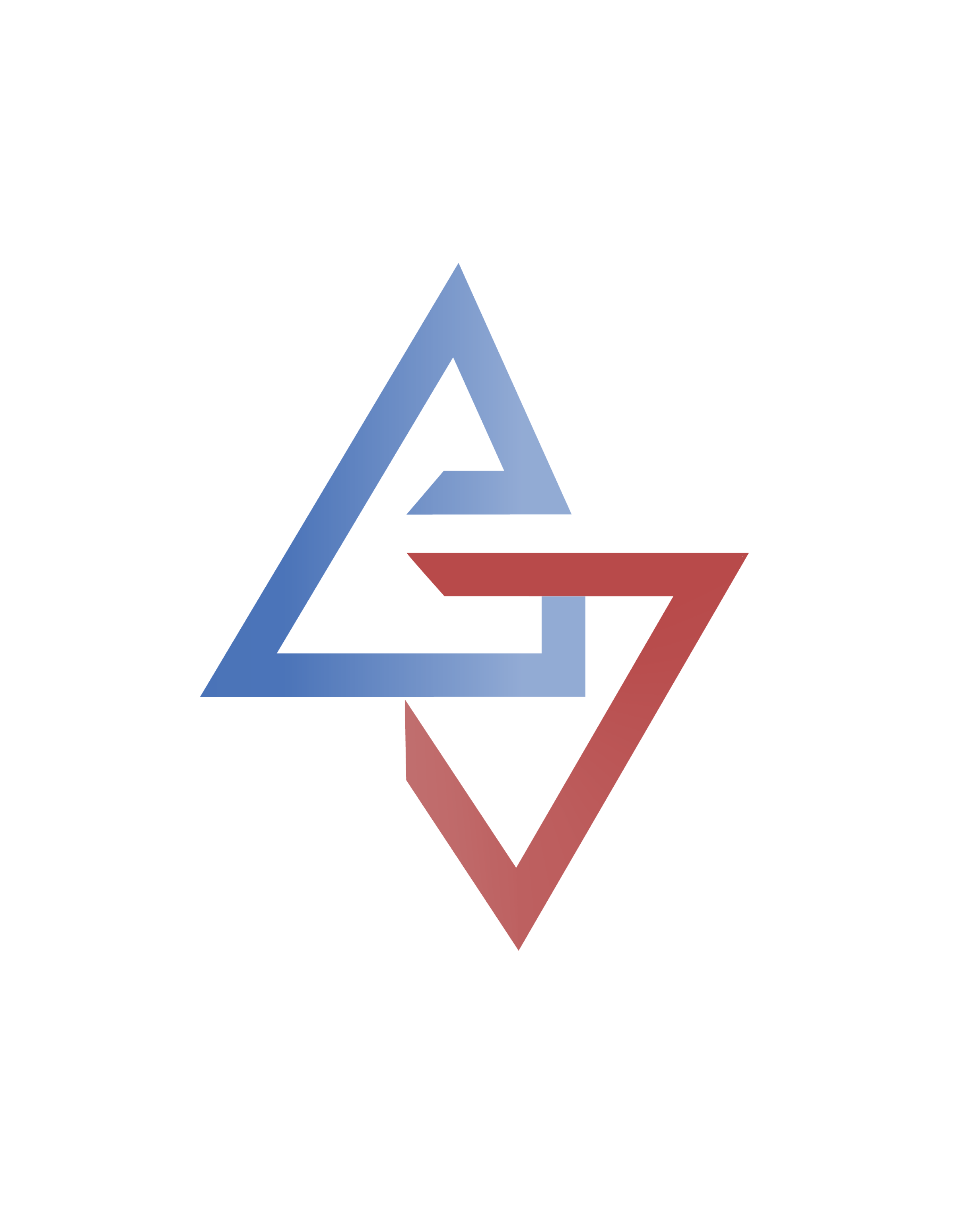
The name represents a lift, both a technological and conceptual bridge between worlds. ETM is built for explorers, innovators, and futurists who believe in expanding human connection beyond our planet.
This timeline highlights the project’s evolution through multiple rounds of design exploration, critique, and refinement. Each critique informed the next iteration, guiding the development from over 80 initial concepts to the final design.
Explored 80+ initial concepts, including hand-drawn sketches, word marks, graphic marks, and combined typography and graphic elements.
View Word Marks ↗View Graphic Marks ↗View Combined Marks ↗
Received feedback from 15 classmates on the strongest design concepts and areas for improvement.
Based on group critique, I selected the three strongest directions and began introducing color while exploring variations in weight, proportion, spacing, and overall treatment.
View Concepts ↗
Received one-on-one feedback from three peers on color choices, typography, spacing, and overall visual direction.
Selected the strongest logo direction for final refinement, focusing on precise adjustments to sharpness, alignment, color, spacing, and weight to create a cohesive final design.
View Concepts ↗
Presented the project’s progress to the class and received feedback on the final elements to refine and polish. Specifcally, thinking about the angles in the logo.
Refined the logo’s angles and gradient colors for a more polished final design.
This animated logo applies core motion principles to communicate the brand’s purpose and personality through movement. By using translation, transformation, timing, and easing inspired by elevator buttons, the animation adds narrative context and visual rhythm, enhancing the logo as a cohesive and expressive mark.