.png)

A high-level map of how users move through BrainPOP, from account creation and site navigation to each product’s content structure and assignments. Due to confidentiality considerations, I’m unable to share the full map publicly.
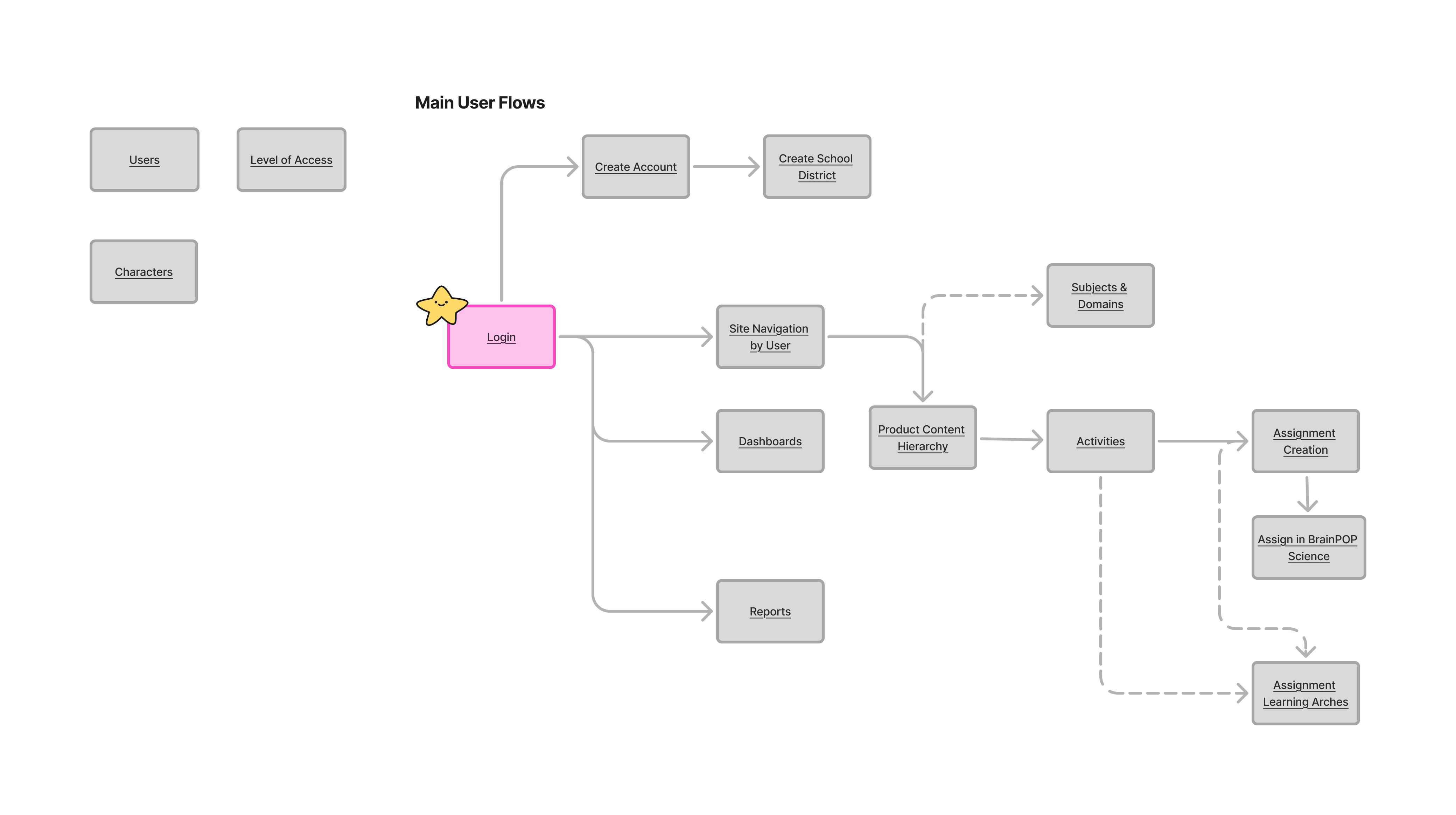
Figure 1.0 - User Flow Map Overview
Figure 1 provides an overview of the entire Product System Map, allowing users to view its structure at a glance. In the file, users can click on any node to quickly navigate to that section. Each node represents a larger section that documents user flows, information architecture, and other aspects of the product experience.
The map was created previously, but I updated its content to address outdated and missing information and incorporate user flows that had not originally been considered.
A key focus of the update was also improving how researchers and designers navigate and use the map, as team members were not consistently referring to it because it was unclear when and how it should be used throughout the design process.
Developed a range of UI components for the POPcorn design system, including activity cards, badges, chips, thumbnails, and other reusable elements. Due to confidentiality considerations, I’m unable to share the full design system or all aspects of the Activity Card component, so this case study highlights selected parts of the work.
Activity Cards contain content and actions about a single activity (i.e. Movie with Pause Points, Quiz, Vocab Builder, Word Play, Draw About It, Worksheet, Creative Coder). It is a clickable, borded box with a hover interaction.
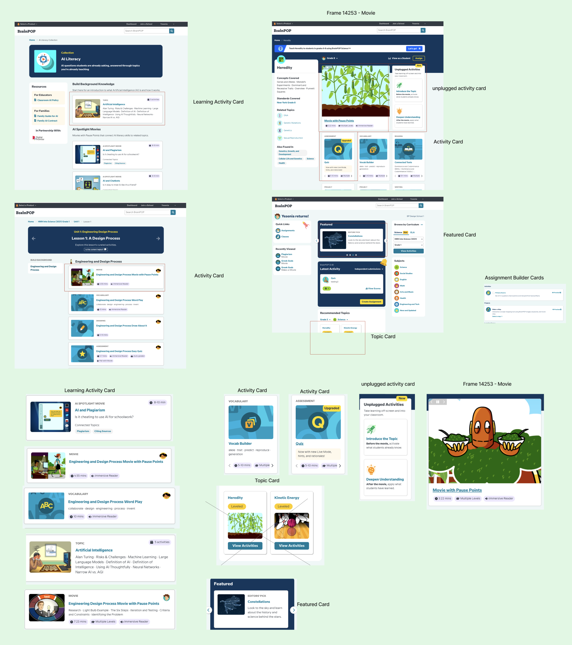
Figure 1.0 - Activity Card Audit
Started by auditing the product to identify where activity cards appeared, how they looked, and the different variants in use. I documented these findings in FigJam, paying close attention to each card’s behavior, content, and design properties.
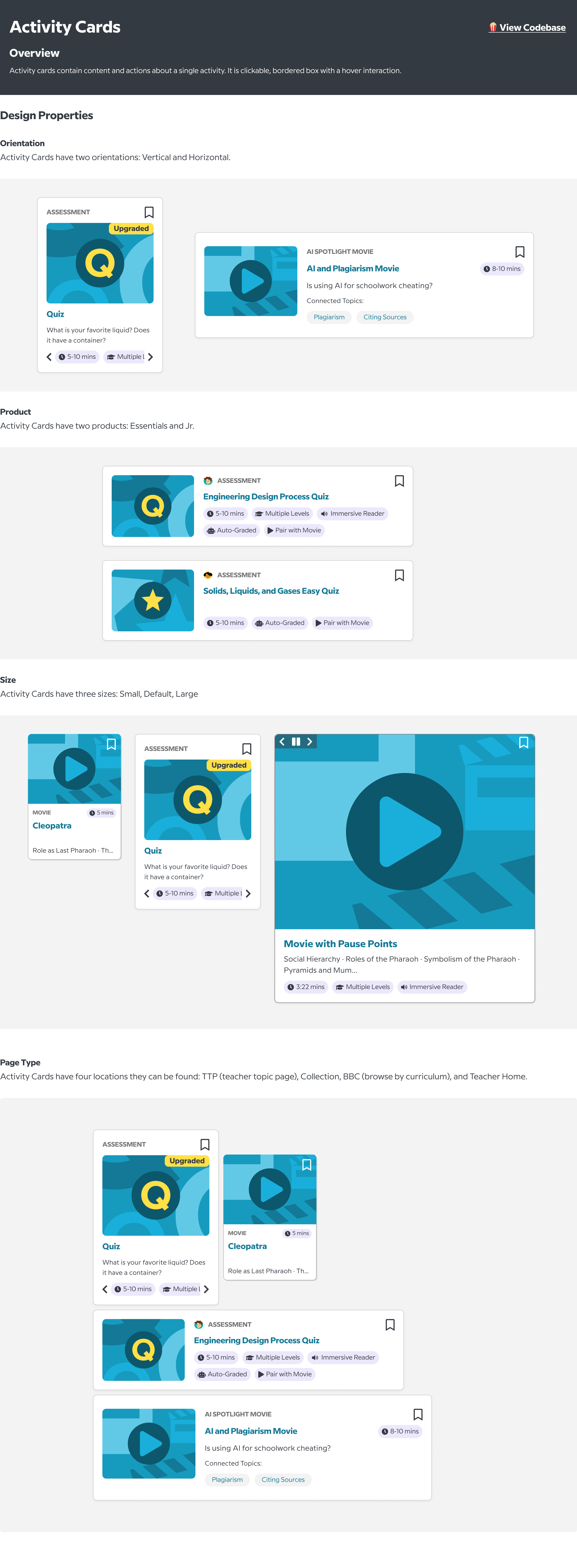
Figure 3.0 - Design Properties
Activity Cards have several properties, including orientation (vertical or horizontal), product (Essentials or Jr.), size (small, default, or large), and page type (Teacher Topic Page, Collections, Browse by Curriculum, or Teacher Home Page).
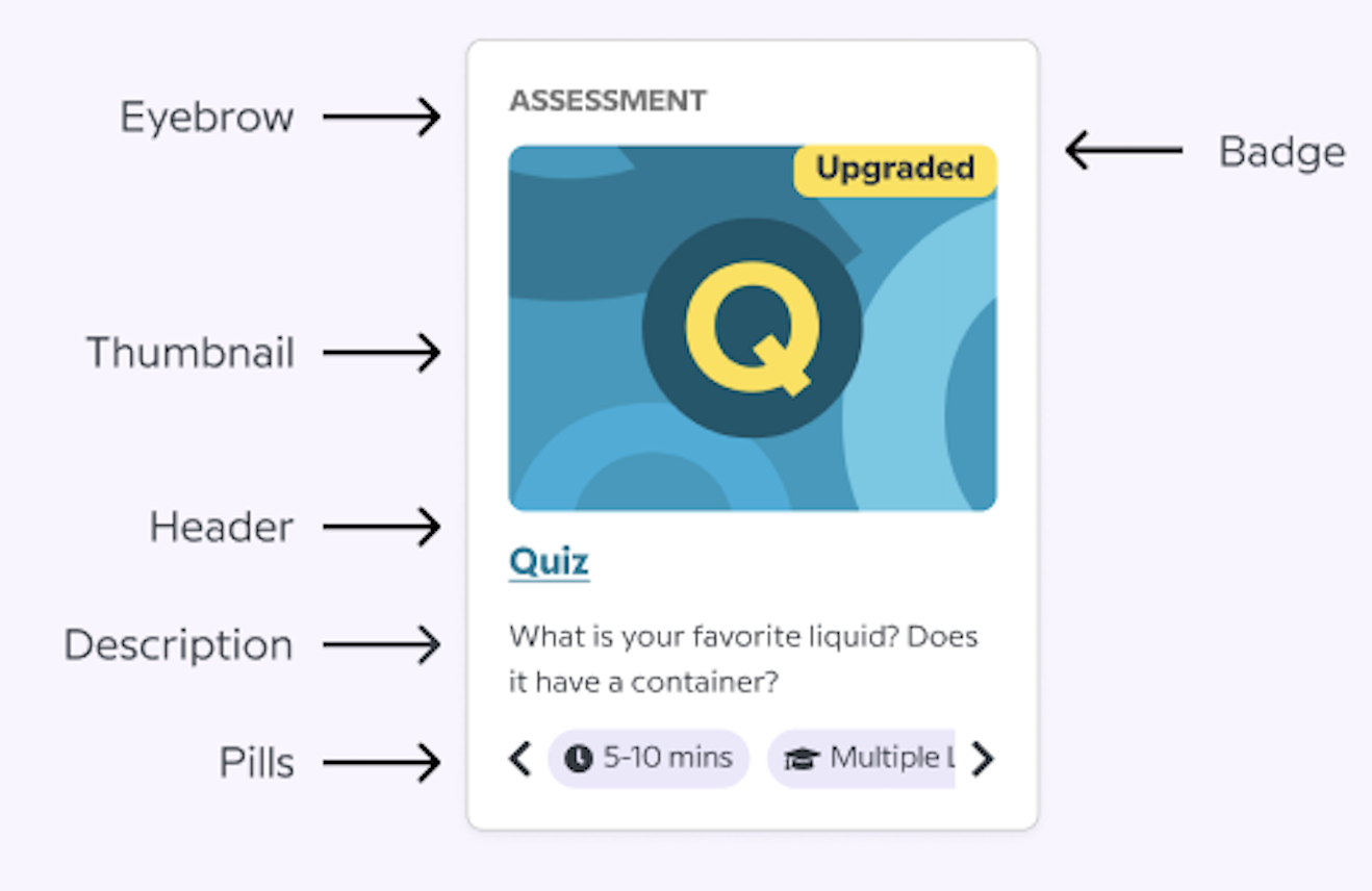
Figure 2.0 - Content Overview
Each Activity Card includes core content elements such as an eyebrow, thumbnail, header, description, and pill, with some cards also featuring badges.
For each element, I documented whether it was required, its placement, purpose, the values it could take, and how those values varied based on the activity type.
Not every Activity Card type included a description, creating inconsistency across the component. I recommended the metadata that should be displayed in the description for each corresponding activity type.
Created a list of the metadata to display in the description for each corresponding activity type.
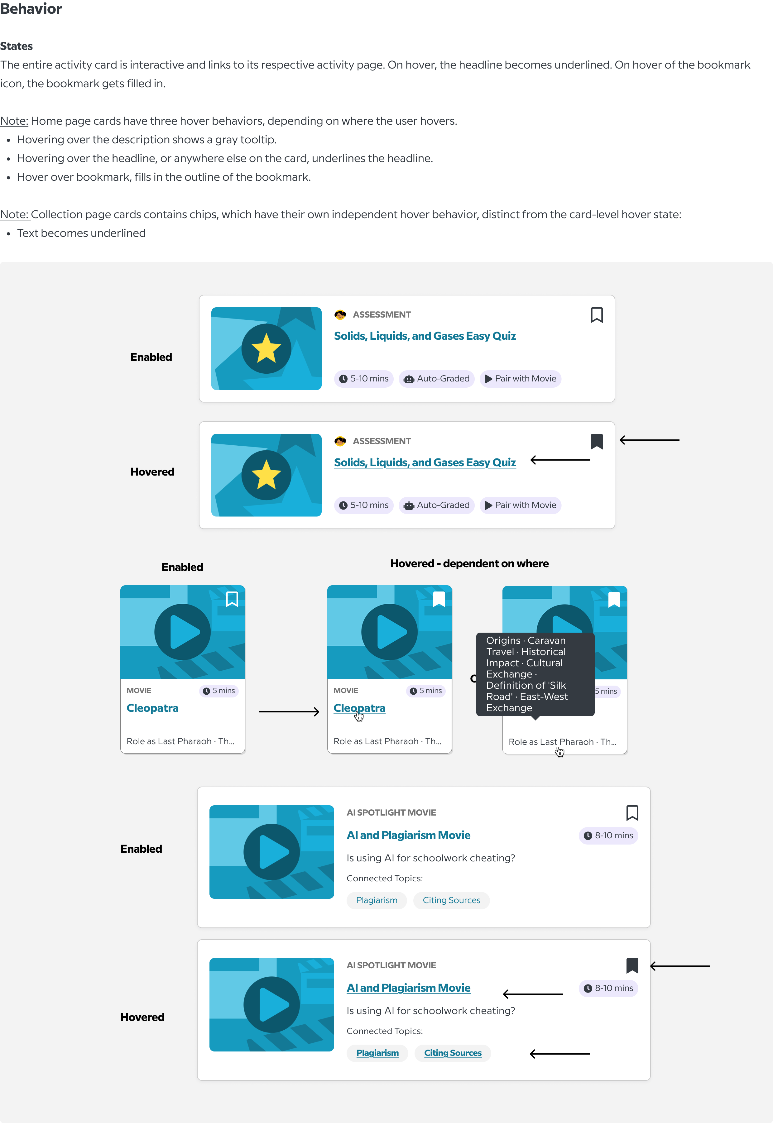
Figure 4.0 - Component Behavior
The interactivity of Activity Cards was inconsistent across page types. While some cards underlined the header on hover, others used a hang effect or underlined the pill text, creating different interaction patterns for the same component.
Standardize the interaction across all Activity Cards by underlining the header when users hover over the card and removing the hang effect. This creates a more consistent experience while avoiding excessive interactivity on pages with multiple cards.
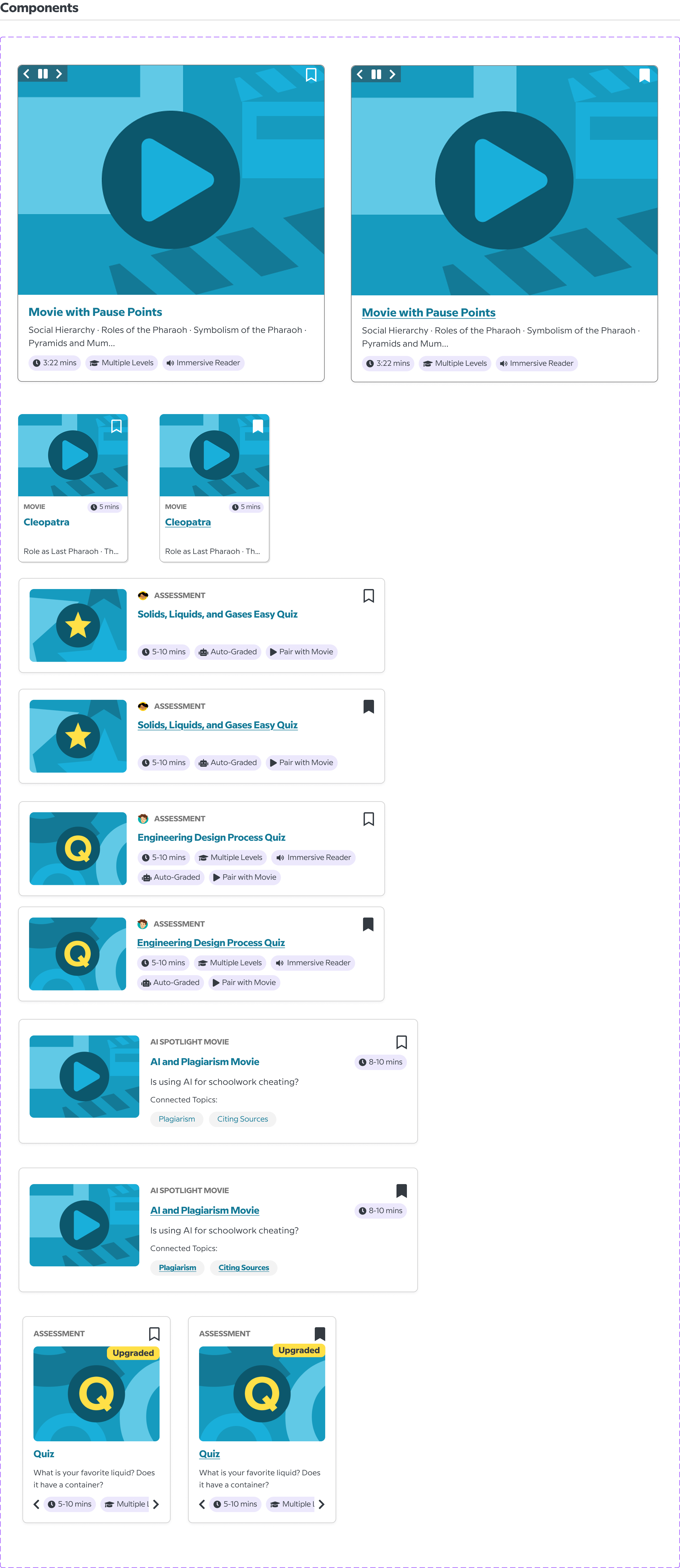
Figure 5.0 - Components
Considering the design properties, content, and behavior, these are the main components of the Activity Cards.
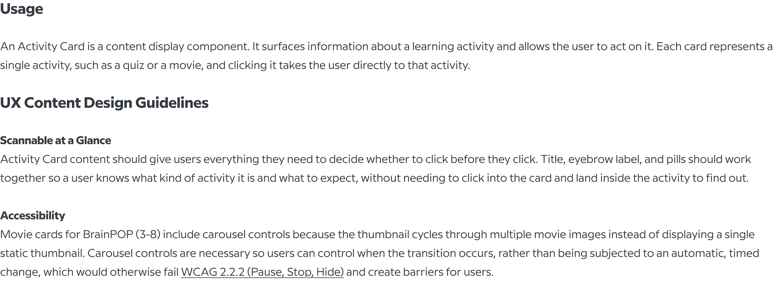
Figure 6.0 - Usage
Outlines how Activity Cards should be used, with guidelines for creating clear, scannable content and ensuring accessibility.
It also addresses accessible interactions, such as providing carousel controls so users can control moving content and avoid barriers caused by automatic transitions.
Collaborated with product designers on the redesign of the BrainPOP teacher homepage for the Back to School 2026 campaign, contributing to rapid ideation, Figma prototyping, design critiques, and iterative refinements to information architecture and interaction patterns. Due to confidentiality considerations, I can only share my initial brainstorming sketches.
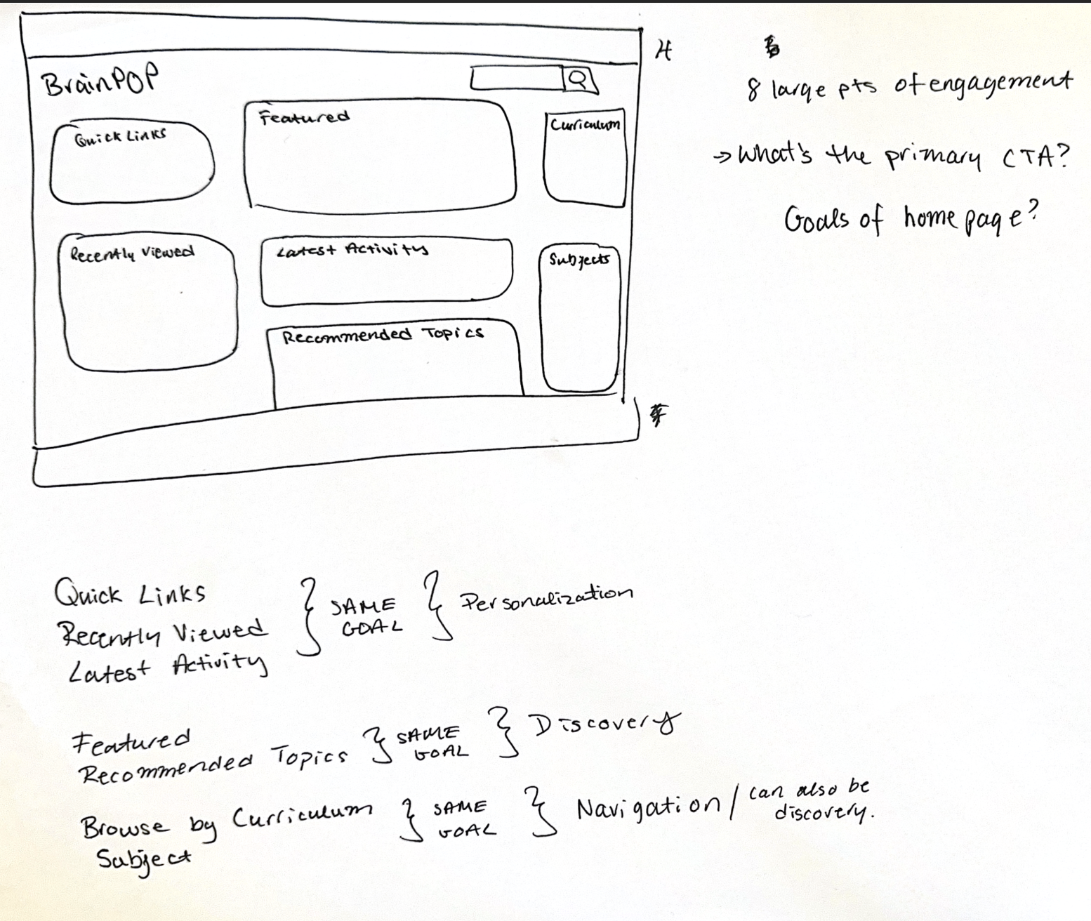
Figure 1.0 - Initial Reactions
Displays my initial reactions to the Teacher Home Page. Key observations included the presence of eight CTAs, a high level of cognitive load, and an overall overwhelming visual experience. The use of color and typography created competing points of attention, making it unclear where users should look first and what actions to prioritize.
.jpg)
Figure 2.0 - Hand Drawn Sketches of Teacher Home Page
Displays some of the early-stage sketches I created for redesigning the Teacher Home Page, exploring ideas for navigation, content presentation, and visual hierarchy.
Facilitated in FigJam, examined BrainPOP’s product systems at two levels: zooming out to understand how users and products connect across the broader ecosystem and zooming in to evaluate the Activity Card component. The session highlighted key updates, design recommendations, gathered team feedback, and identified opportunities to refine both systems.
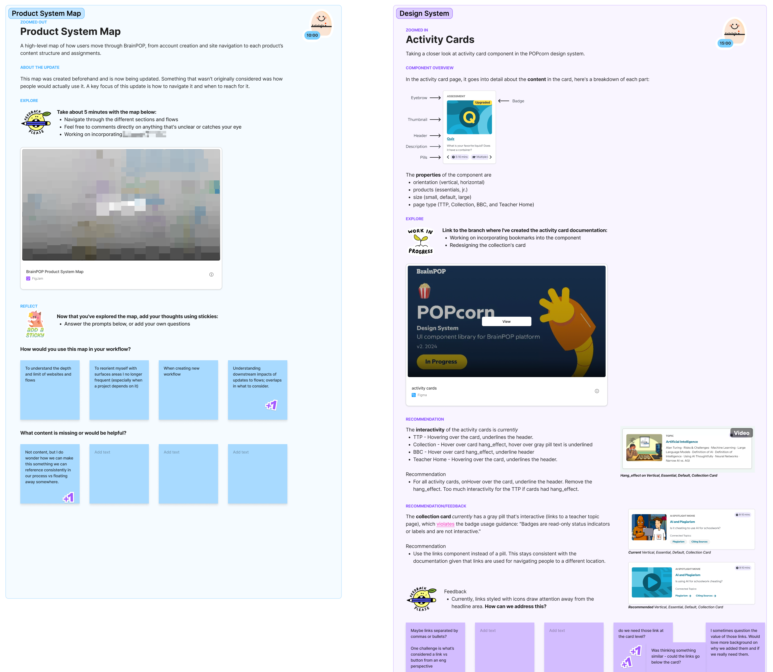
Figure 1.0 - FigJam Presentation & Critique
The session resulted in a clear list of refinements for the Product System Map and Activity Card component, along with specific workflow moments where the team could use the map moving forward.